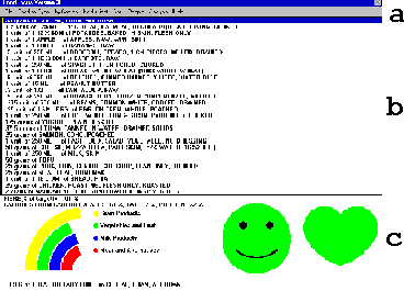
At the bottom of the FoodFocus main screen, you will find a summary
of nutrient analysis results for all the foods listed in the food list
in the middle of the main screen.
After this lesson, you will be able to understand the information conveyed in the lower portion of the main screen (See c in figure at the left.) including:
This lesson and lessons 2-4 illustrate the basic layout of the FoodFocus main screen. These lessons are intended to not only illustrate typical FoodFocus displays but also to provide an overview of how FoodFocus can be used.
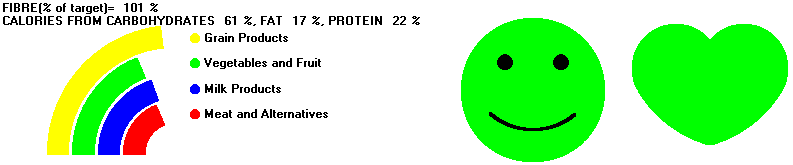
The nutrient analysis summary area at the bottom of the FoodFocus main screen contains the following information:
Example: FIBRE (% of target)= 101%
Example: CALORIES FROM CARBOHYDRATES 61%, FAT 17%, PROTEIN 22%
Report Card Marks Alternative for Fibre Summary and Source of Calories
As described in lesson 14 you can display a simpler version of the nutrient analysis summary which does not require an understanding of the significance of the numeric values of sources of calories. This approach is called "Report Card Marks" and it only requires an understanding that a mark of 50 is poor and 100 is good.
Example: REPORT CARD (marks of 50 = poor, 100 = good)
FIBRE = 59 CARBOHYDRATES = 55 FAT = 50
 Guidelines-
For a pregnant user, the heart is replaced by a baby carriage
which reflects the degree to which nutrients of particular importance for
baby health (energy, protein, calcium, iron and folate) meet recommendations.
Details in lesson 2.
Guidelines-
For a pregnant user, the heart is replaced by a baby carriage
which reflects the degree to which nutrients of particular importance for
baby health (energy, protein, calcium, iron and folate) meet recommendations.
Details in lesson 2. Think of examples in which having instantaneous feedback of nutrient content is particularily useful.
How pictographs are used to simply convey nutrient analysis results.
Comments to matt@foodfocus.com